

I started the writing session by playing with XO, intending to do a beat thing. I played, but didn’t really get any traction with anything. Then I played with various instruments, focusing on some of the synths that I don’t use very often. Again, nothing really stuck. I went through the random finds playlist and became more distracted than inspired. Lots of things that I’d be interested in doing, but none of my initial attempts were really grabbing at me. At this point, I decided that it was probably a “contractual obligation track” night and I’d just do some quick thing and post it.
- Stet Ray Toler 5:32
These types of tracks aren’t bad, and some have even become favorites. When I was learning piano and practice was getting to me, I’d take a quick break and play something familiar or easy – this one blues riff, the Moonlight Sonata, one of my typical chord patterns with some improvisation on top. I do the same thing in Song-A-Day from time to time, because the outcome is likely to be better than if I tried to force “creativity.”
Turnaround
As it turns out, this one ended up being not an obligation track, but an experimental one., and a relatively successful one at that. I started with a drum pattern in XO, tweaked it quite a bit, replaced sounds, tweaked some more. Next, I went to Choreographs to find some ticky noise patterns. I’ve been listening to a lot of Autechre lately, and the sound has been on my mind.
I found something I liked, then reached for Gravity 2. It’s doing the main melodic bit you hear throughout the entire piece. I improvised two sections, moved them into a structure, improvised a third for variety, placed it, and was at about 3 minutes or so runtime. At this point, I was still in obligation mode and figured this was good enough. But at this point my brain kept thinking of other things that I could do and it became more interesting.
I’ve been trying to become more comfortable with only playing a cool sound once in a track. Normally, I’ll find some cool sound and play the hell out of it, but I noticed that a lot of the little bits in music I like were barely present, and that made them more impactful. That dash of spice that elevates the whole dish rather than overpowering it. Great. Things are sounding pretty good at this point, it’s 11:30, and I’m tired, so I decided to shut down and see if there was anything else to do in the morning after some sleep.
Let’s Do Some Science!
I used Slate + Ash’s Choreographs library on three tracks in this piece. Two of them are the ticky extra rhythm patterns that show up and go back and forth throughout the arrangement, and the other is the soft synth arpeggio that comes in a couple of times. None of these tracks are particularly engaging, especially on their own, but they led to me doing something cool.
As I’ve mentioned many times, I’m a preset-jockey and have absolutely no shame in using a premade patch. With the S+A stuff, there’s so much already there that I often don’t have to do very much, but I did a track in 20211See: Dogmatic Impressionism where I went through one Cycles preset patch that had lots of cool interesting patterns and which made up the bulk of the piece. The product was still very new to me and I learned, much to my later embarrassment, that I’d been playing all of the basic loops of the library. These weren’t presets, they were kind of the core content. It was kind of like saying that I’d written a story and the text was “A BC DE FGHI J KL.”
What’s wonderful about the S+A products is that they take that core content and mangle it into unrecognizable things. And the engines are incredibly powerful. On its surface, Choreographs is just an arpeggio / sequence thing. I had figured out how to do a few basic things like connect distortion to an LFO, but I kept running into this problem over the course of the month where I’d be exploring a sound, click a thing to see if I could get something good out of it, decide that it wasn’t what I was looking for, but then be completely in the dark about how to turn it back off.
That happened to me this morning as I was messing around with the rhythm patterns. If I have a criticism of Slate and Ash, it’s that their dedication to a minimalist user interface goes way beyond aesthetics and starts interfering with my ability to get things done. Their website is the same way. High style, but you’re going to pay for it. So I decided to do the unthinkable and read the manual. Except that there isn’t one.
Rather than provide any kind of written guide, S+A has videos. Sigh. Fine. The overview is over 20 minutes long, but I figured I’d skip around to try and find the bit I was looking for while drinking a cup of coffee. I ended up deeply engrossed and watching the entire thing, repeating several sections. This thing is a monster! There’s so much more to it than I knew, and I already considered it one of my highest ROI purchases of the last five years.
While my knew knowledge was only superficially applied to this piece, I did end up experimenting for a bit and suspect that I’ll be doing more in the next week or so. Since week 3 is when stuff gets officially weird, I guess I can get away with some weirdness.
Some Studio-Fu
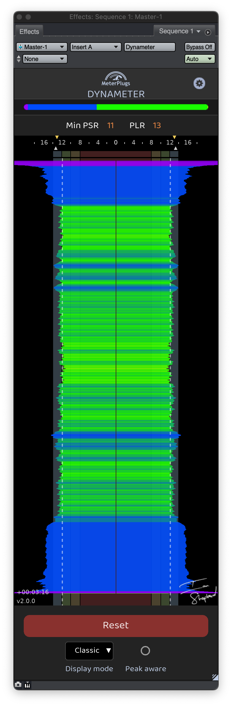
When it came time to do the final mix and master on this one, I ran into a couple of problems. First, it was too dynamic.2The range between the softest and loudest parts of the audio I’ve used Dynameter from MeterPlugs to visualize this aspect of my productions for several years now. It’s a plug that takes people some time to wrap their head around because it’s not showing loudness or volume like we’re used to waveforms representing, but rather representing dynamic range. Put another way, it shows how much “sameness” there is as we move through an audio file.
In the nearby image, the blue stuff represents highly dynamic sections, while the green is “sweet spot” levels where things normally sound good. If I had anything really non-dynamic in the piece, you’d see yellow and red. None of these things are good or bad… just information. If I played the most gorgeous sustained chord with a large string section, that part of the audio would be yellow or red, because it’s not changing. There are times when you want more dynamic range, and times when you want less.
But my initial mixes on this were solid blue for the entire track, meaning that it was too dynamic and I had some opportunities to bring up the overall loudness levels without having to take the life out of it. This helped me identify that I needed to turn the XO drum pattern down a bit and do a little more compression on the drum bus, and bring the synth parts up a bit more.
I’m already well over 1,000 words here, so I won’t go into detail on loudness,3I’ll save that for another day but I typically master to a value of -14 LUFS. This is mostly so that when I listen to my own stuff after Song-A-Day is over, the volume isn’t jumping wildly from track to track.
Ok, so I now have most of the track landing in the green zone as far as dynamics go, and my mastering limiter is showing an overall loudness value of about -14.2 LUFS. Perfect. Print it. Post it. Done.
Mix With Your Ears, Not Your Eyes
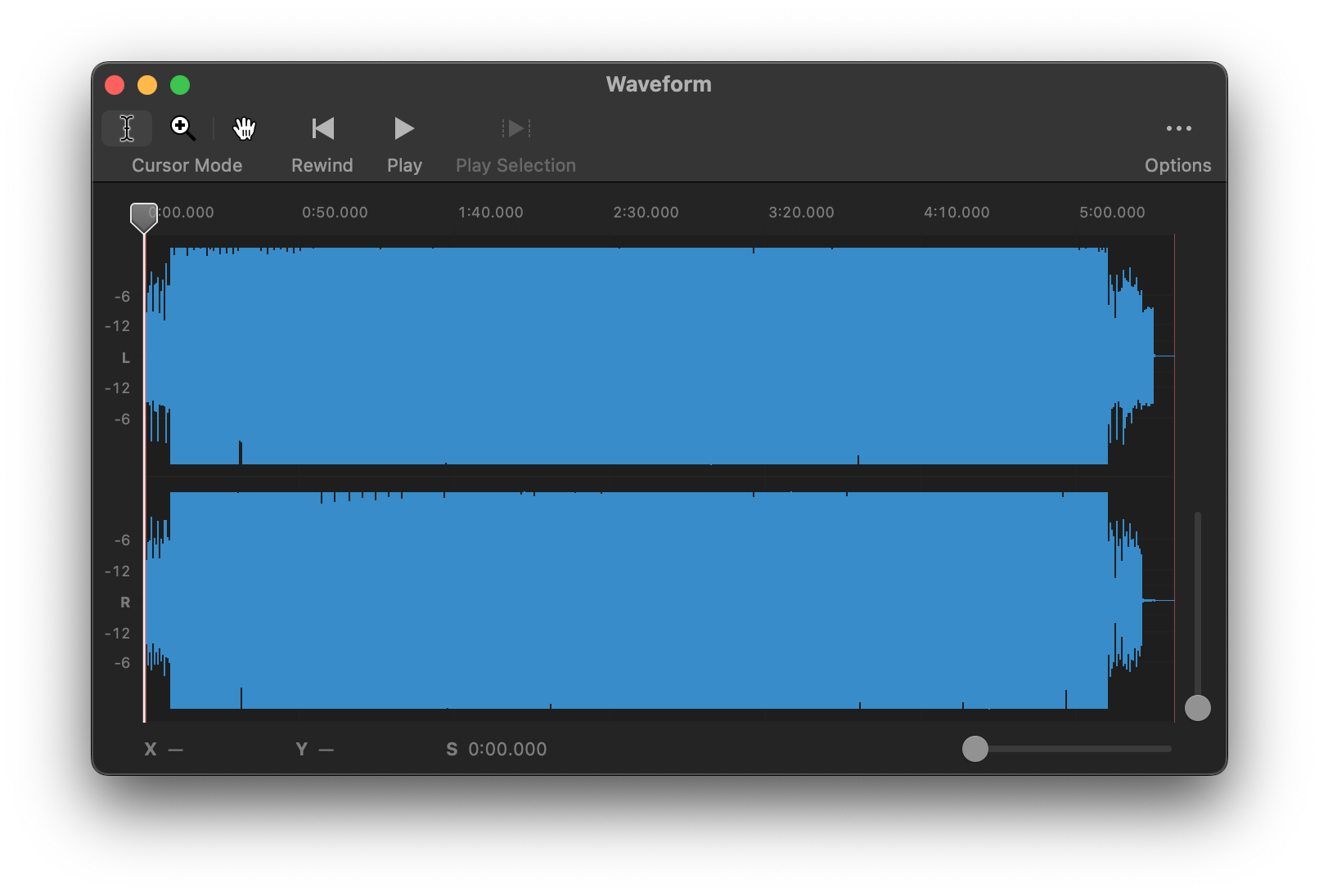
While I was doing some additional cleanup, I happened to look at the waveform pattern for the mastered track. It looked like a sausage! No peaks and valleys, just a solid block. This typically means that the track is over compressed and waaaaaay too loud with no dynamic range at all. But it sounded good. And how the hell did I go from too dynamic to Metallica Death Magnetic?4Widely regarded to be the worst-mastered album of all time. It has since been corrected, but anyone who’s read up on the loudness wars will have heard about this one. And why wasn’t Dynameter showing me a completely red overview?
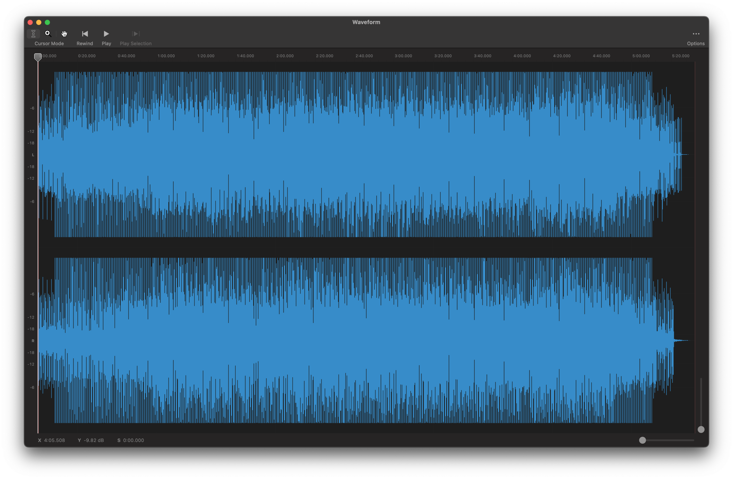
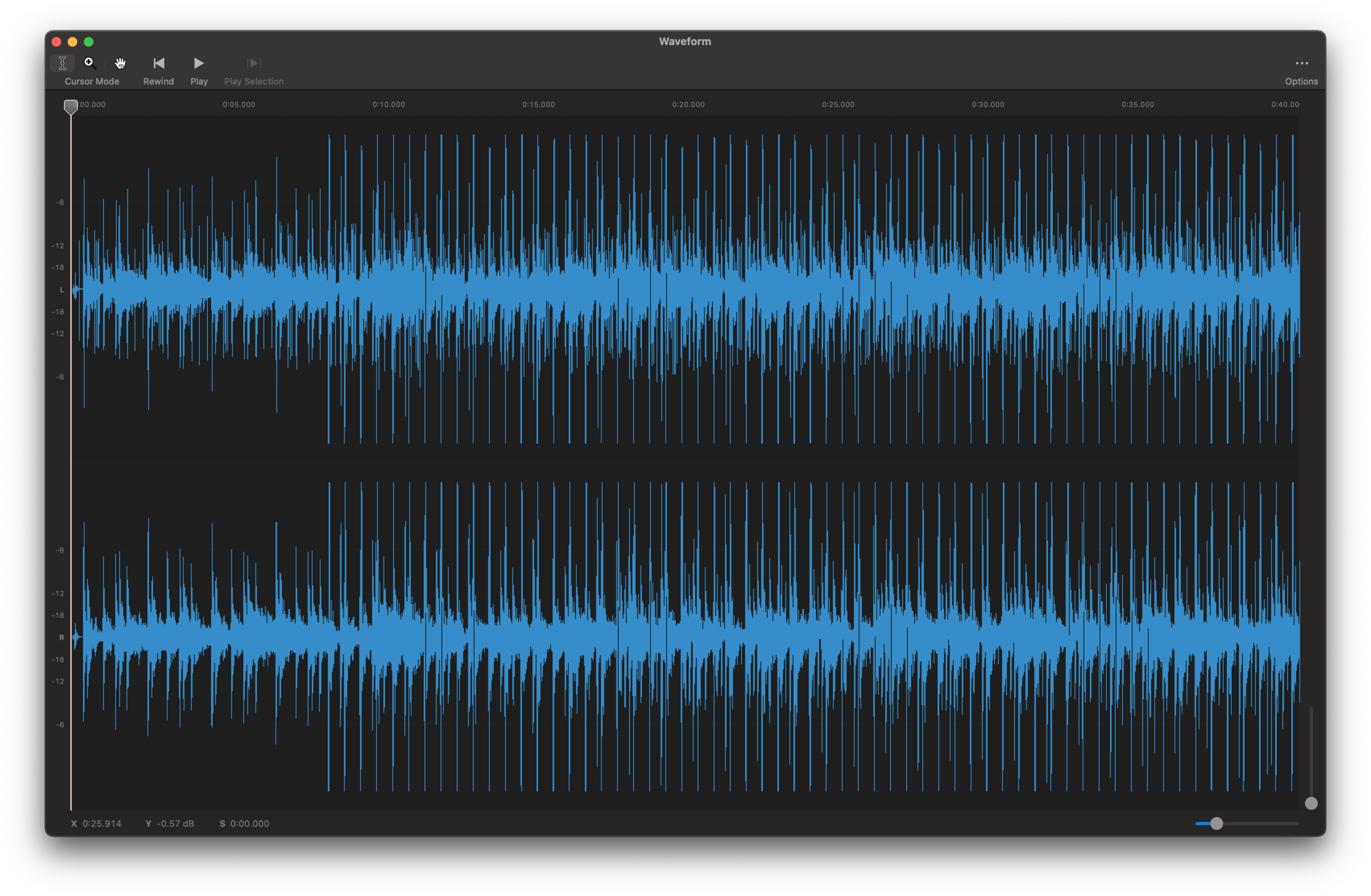
Well, the answer is magnification. I was zoomed way out and the window was small. When I made the window larger, I got a little more detail. Then I zoomed in on the waveform and it looked beautiful. In the nearby image, you can see that the spikes that go all the way to the edges represent the kick drum, which is nearly all bass energy. But you can also kind of see the average loudness stuff inside of those peaks, and that’s the loudness you perceive. I’ve zoomed way in for the final image and you can really see how much dynamic range is present between the kick drum and everything else. Again, this isn’t necessarily good or bad – it all depends on the end goal.
We have fantastic software tools now that can help us identify all of these things, and I will admit to using my eyes a lot more these days – it’s easy to see weird spikes or obvious imbalances – but it’s also really important to remember the most important rule of audio production: if it sounds good, it is good, whether the “rules” or the images say so or not.
Colophon
Instruments & Samples
Choreographs, Cycles, Gravity 2, XO
Effects, Mixing, & Mastering
FabFilter, Gullfoss, PanMan
Notes
- 1See: Dogmatic Impressionism
- 2The range between the softest and loudest parts of the audio
- 3I’ll save that for another day
- 4Widely regarded to be the worst-mastered album of all time. It has since been corrected, but anyone who’s read up on the loudness wars will have heard about this one.